17 Creative Newsletter Designs for Growing Businesses
Over the last decade, there has been a massive shift from traditional to digital marketing channels. However, you can not overlook the impact of direct mail marketing collaterals like printed newsletters. Let us do an exercise to understand this. Recall the names of all the email newsletters you have subscribed to. We bet you can not think of many. Now, think of all the newsletters you get in your mailbox. It is easy to remember those brand names since you get only a handful of them.
A printed newsletter stays in the audience’s home, and the people remember the brand name. However, you need to design them thoughtfully to get the maximum benefit. This blog will walk you through the benefits of using printed newsletters in marketing over their digital counterparts and 17 creative designs that can help with business growth. We will also share some tips you can use to create pieces that yield desirable results.

Key Takeaways
- Printed newsletters are more likely to get noticed than email newsletters that get lost in the inbox.
- Their tangibility engages multiple senses, which helps build an emotional connection with the customers and strengthen brand recall.
- To design an impactful newsletter, you must group your audience, use an enticing headline, and build an organized layout.
- It should serve the audience’s needs. You can provide insightful content on the latest developments in your industry, expert opinions, and more.
- PostGrid automates the printing and mailing of direct mail pieces. It also allows you to customize them and add tracking elements.
Benefits of Using a Printed Newsletter Over an Email Newsletter For Marketing
Increased Likelihood of Being Seen
You must be bombarded with dozens, if not hundreds, of emails daily, which you must be ignoring. A printed newsletter, on the other hand, is delivered to your office or home. It sits on the desk or the counter, which can be hard to ignore. Moreover, printed newsletters take up physical space, allowing the message to be seen multiple times over days or weeks. This repeated exposure increases the possibility of engagement.
Tangibility Creates a Long-Lasting Impact
When people hold a printed newsletter, they engage with it in a personal and memorable way instead of just scrolling through the email. The entire focus of the brain is on reading, leaving a lasting impression on them. This is not the case with email newsletters, which have distractions like pop-up ads that make the brain quickly forget the information.
A well-designed newsletter makes the reader think the brand invests in high-quality, tangible communication. They will associate this with your service, convincing them to engage with your business.
Longer Shelf Life
Your customers can’t make a printed newsletter disappear with a click of a button like an email. It will stay in the home or office until they discard it. This prolongs the engagement. Moreover, since it is a common practice to pass printed pieces to friends, colleagues, etc., this extends the lifespan of these marketing materials and increases the chances that many people might act on the message.
More Creative Freedom
When you design an email newsletter, you have to limit your creativity to fit screen sizes and devices. However, you can experiment with the printed newsletter as much as possible. You can try different layouts, colours, fonts, textures, images, and more without worrying about how it will look on various devices.
You can utilize space and structure in a way that is not possible by email newsletter. For instance, you can include large, full-page photos, illustrations, and even fold-out maps inviting readers to interact with them. You can also improve the physical appearance of your printed newsletter by using special techniques like foil stamping, embossing, and coats like matte and gloss. This will give it a premium look and feel.
Boosts Brand Awareness
As mentioned, you can hold, keep, or pass around a printed newsletter. This increases the lifespan compared to email newsletters, which you can delete or forget in a crowded inbox. The printed pieces can stay at the office desk, or you can pin them to the billboard. Multiple people will notice it as time passes, giving your brand continuous exposure. Since they offer a tactile experience, they command more attention. Readers will pause to read the content and spend more time than email newsletters, which get skimmed or ignored.
Printed material’s perceived value is higher than digital content’s, and readers trust them more. This is because, in a world where readers receive hundreds and thousands of digital marketing ads, the tangibility of printed newsletters makes them stand out. You can send them to your customers to demonstrate your commitment to high-quality service. This will enhance your brand credibility and strengthen awareness among your audience.
Multi-Sensory Experience
Reading a printed newsletter engages more senses than the email counterpart. The customers not only see the content but also feel the texture of the paper. This makes the reading experience memorable. With time, people are more likely to recall your brand because their minds associate it with a richer, immersive experience than the one-dimensional, screen-based interaction of emails.
A printed newsletter shows readers you value them enough to send them high-quality physical mail. This feeling of being thought of creates an emotional connection, which improves brand recognition. This ensures that your brand name stays at the top of their mind when they plan to buy a product or service.
17 Newsletter Design to Inspire Your Next Campaign
Greenpeace
If your brand promotes sustainability, you can combine organic imagery with an earthy tone to convey the message, like in the image below. See how the background complements the message, and with the minimalist and clean design, they have directed the entire focus on what they stand for.
Xplore
You can add dynamic colours and geometric shapes if you want your brand to align with the trends. The sharp lines, shapes, and patterns with bold colours remind the reader of the bustling Shibuya shopping district. The contrasting black colour with saturated tones on the top makes the content pop out and encourages recipients to read further.
African Heritage Studies Association
If you plan to distribute the newsletter in a formal setting, such as a conference or a meeting, you can use the image below as an example. See how the strategic use of soft tones creates an information hierarchy, guiding the reader’s eye from one page to the next.
La Memoire Vive
What if we say you can use infographics and data points in a newsletter to create beautiful pieces that reinforce your authority and build trust? You can take inspiration from La Memorie Vive’s piece to educate your clients and partners with data-backed insights in a visually appealing way.
Magnolia
If you want to send the first newsletter of the year, opt for a fresh, clean look like the image below. The green accents, along with the simple black and white illustration, give it an elegant look. You can also take a cue from it about placing important information while maintaining the layout.
Act News
If you want your newsletter to look vibrant and magnetic, take inspiration from the image below. The use of saturated colours with motifs makes the message clear. You can also write the title in lowercase to maintain a professional yet low-key look. You can also add a semi-transparent text box like they have to highlight what your newsletter contains without reducing the quality and effectiveness of the whole piece.
A News
If you want your images to do all the talking, you can take tips from this example. The entire newsletter has pictures with short content in the center that holds attention. You can also use oversized fonts to grab attention. If you plan to use contrasting colours and images as they have, ensure they are not highly saturated colours with vibrant tones because it will strain the reader’s eyes.
Vinoly
Another example of where the image speaks for itself is Vinoyl. The full-page architectural image immediately indicates that the brand focuses on high-level design and innovation. This makes it feel premium and exclusive, encouraging the readers to engage further. You should also notice how strategically they are using colours and contrast. Using a white and black header with a vibrant image will draw the customer’s attention to the important elements. This will ensure that the branding will stay dominant even with a prominent image.
Grobund
You can give your newsletter a modern, approachable, and friendly look by playing with colours like in the image below. There is a pastel-colour geometric design behind the text, which makes it look vibrant without compromising on the readability of the text. Another lesson from this image is combining fonts to create a visually interesting layout.
Valent Bisocience Corp
If your newsletter is going to be content-heavy, make use of white space, typography, and contrasting colours. You can take a cue from this Creativity International Award Winner for B2B Newsletter Design. Notice how they have used contrasting colours and ample white space to highlight important messages and break the text.
Lux
If you want to see how typography can make a difference, look at the image below. Notice how they have made their brand seem elegant and authoritative with a serif font. You can also blend information and pictures like they have. Keep one side for visual learners and the other for those looking for in-depth information. Like them, you can also subtly place the logo of certification or partnership to build trust and authority.
The Cut
You can also make your newsletter look like a high-end fashion or art magazine, like the one below. Use bold yet minimalist headings to make the brand easily recognizable. Organize the content section as they have done. This will provide a quick overview to the customers about what the newsletter contains.
Fashion
Give your newsletter a minimalistic and elegant look like the image shown below. Take a cue from how the brand has used a clean layout with ample whitespace to enhance readability. Do you notice how they have created a visual hierarchy by keeping “Newsletter” in bold? This guides the reader’s focus. You can also see how each section at the bottom has a numbering. This ensures that the readers can find what interests them and are engaged.
The Food Truck
If you are wondering how to create a strong visual representation while maintaining readability, the image below can help. It uses bold, eye-catching colours like yellow to evoke emotions and make the newsletter visually appealing. With a clear heading, bullet points, and structured content, it is easy to focus on the key points.
Power Through Peace
This is another example of creating a striking visual theme while balancing content to image ratio. You can use abstract, colour-contrasting images to make a strong first impression. To make your message stand out, use bold typography and experiment with font size and placement so customers don’t miss the key messages.
Art News
This is another example of using contrasting colours. You can see how the arctic shade landscapes take up the major area of the cover, and the orange and gold colour in the background draws the customer’s attention to it. This contemporary design is suitable for businesses looking to enhance their brand image.
Cascade Hallow Courier
If you are a local business that wants the newsletter to reflect that you connect with the community, you can use the image below as an example. They engage the customer by showcasing the outdoor lifestyle and prompting the sipping heritage prevalent in the south.
Tips to Create an Effective Newsletter
Segment Your Audience
To ensure the printed newsletter’s content, tone, and design are relevant, segment your target audience before deciding what to include. Categorize them based on demographics, location, purchasing behavior, etc. This will increase the likelihood that your customer will read, retain, and act on the message.
Create Engaging Headlines
The headline is the first point of contact between the content and the reader, and it will set the tone for the entire newsletter. Hence, it should grab the attention and encourage the recipient to read further. Keep the following things in mind when deciding on the headline:
- It should be short and immediately communicate the value of the content.
- Use verbs like unlock, transform, and boost to encourage the reader to take an action.
- Directly speak to the audience by using words like you and your.
Focus on Quality Content
Your content should be well-researched and thoughtfully written to provide value to the customers and engage them. It should address their pain points and offer them solutions. This will encourage them to take action, such as buying a product or contacting your business. You can use the following form of content.
- Tips
- Best practices
- How to blog
- Expert insights
- Industry trends
- Success stories
Remember not to add too much information, as it will overwhelm the readers. The golden rule is to stick to 1 to 2 messages per newsletter so that they can quickly grasp the content and take the necessary action.
Provide Value to the Audience
Aside from high-quality content, you can offer limited-time discounts or access to exclusive events. This will make the customer feel important. You can also involve them by including polls and surveys in your newsletter. This will build connections and also provide you insights to improve future content.
Create a Well-Designed Layout
As you can see in the examples above, a clean and organized layout guides the reader through the content in a logical and engaging manner. Moreover, a consistent layout will create a stronger connection with the recipient since they can instantly recognize you. You can use the tips below to give an appealing structure to your newsletter.
- Divide the newsletter into columns of two or three. This will make it easier to scan the content.
- Use whitespace to create a balanced look
- Add images to break up texts, but use them sparingly to avoid clutter
- Place your logo in a prominent place so customers can easily notice it.
- Add headings and subheadings to highlight important information.
- Use bullet points or number lists to make scanning and absorbing the content easy for readers.
Use Correct Typography
The font style can play a crucial role in reinforcing brand identity. For instance, a modern sans-serif font conveys that a business is tech-oriented. On the other hand, quirky, artistic fonts such as Lobster or Cavaet signal towards a fun brand.
They can also be used to establish a visual hierarchy. For instance, you can use different font weights for headings, subheadings, and calls to action. This will make the content scannable and help readers quickly find what they are looking for.
If you plan to use multiple fonts, ensure they complement each other and don’t create visual clutter. Moreover, we advise matching the font on the newsletter with other marketing channels to improve brand recognition.
Add a Clear Call-to-Action (CTA)
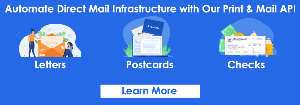
After providing detailed information, add a straightforward CTA telling readers what to do next. You can also add a tracking element to measure the campaign performance. When you use PostGrid Print & Mail API to create direct mail pieces, you can add a QR code or PURL with CTAs and track the responses for all the pieces from a single dashboard. You can use these insights to optimize future campaigns for better results.
Personalize
Customers expect their direct mail pieces to be personalized. You should refer to the reader by their name because this increases the response rate by 135% (according to Mail Shark). You can also add their job title, company name, and personal message. However, doing this manually will take up a lot of time, and since you will distribute the newsletter on a mass scale, there is a strong possibility of errors. Instead, you can use our solution, which offers variable data printing technology. You can modify the background image, text, font, style, and other aspects for each piece, and we will also automate the printing and mailing batches of newsletters.
You can add personalized discounts or offers based on past purchases to make the customer feel valuable. You can also conduct a behavior analysis to determine which products and services interest the reader. You can create a section of these recommendations in the newsletter.
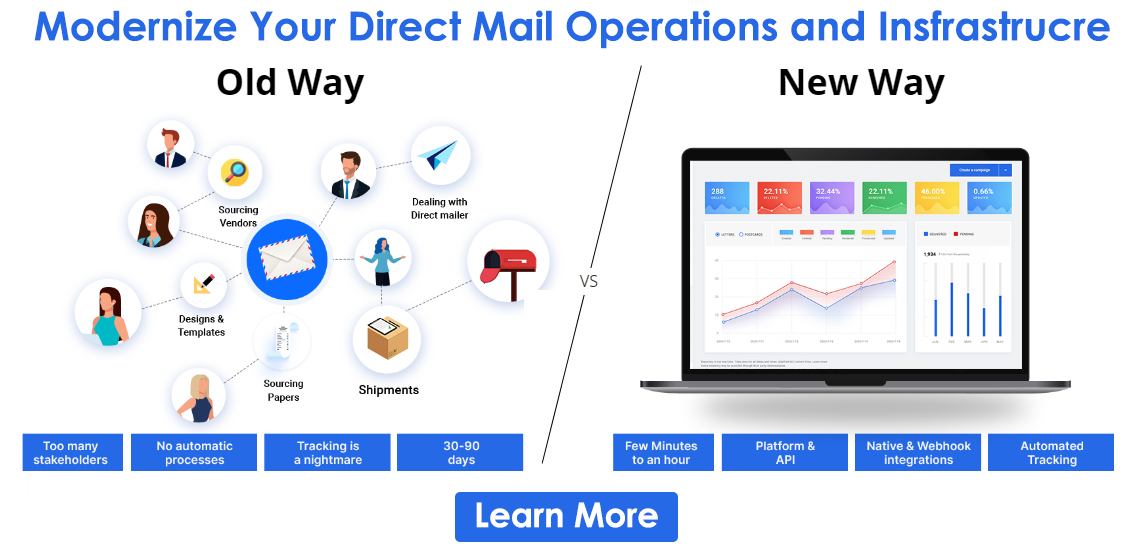
Use PostGrid Print & Mail API to Create Impactful Direct Mail Pieces
A well-designed printed direct mail collateral cuts through the clutter of digital marketing and helps develop a connection with the audience. However, manually processing them can be challenging. This is where we can help you. Whether you want to print and mail a handful or thousands of personalized letters, postcards, or self-mailers, we will automate the entire process, ensuring precision in every piece. If you want to know how we can help you, request a demo now.